COLOUR ME
This assignment draws on what I have learnt so far. Working with visual dynamics, colour and visual language.
My brief was to create an A3 poster that celebrates a colour of my choice. The colour needs to have meaning to me, and I need to explore this and what it means to other people.
I can only use my chosen colour, it’s complimentary colour, black and white.
YELLOW
My choice of colour was easy. I chose Yellow because of the the song ‘Yellow’ by Coldplay. The song has sentimental meaning to me although the colour itself is far from my favourite, which posed a challenge.
Yellow is a very happy colour – Like sunshine and buttercups! It is also the dominant colour used in Stefan Sagmeister’s “The Happy Show”
http://thehappyshow.tumblr.com
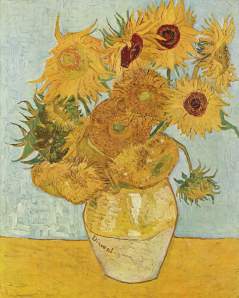
There was also a rare point of ‘excited optimism’ in Van Gogh’s life, where he created his Sunflowers. He painted 7 different versions, to him, Yellow was a symbol of happiness.
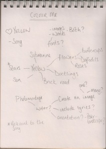
First, I decided to brainstorm ‘Yellow’, I used google as well to make sure that there wasn’t anything obvious that I had missed. At this point I felt that I could go down one of two routes:
1.Use any yellow object I could think of.
2.Use the lyrics, either as text or to come up with imagery relevant to the song.
After doing the photomontage exercise, I wanted to try and use that format again, as it gives a lot of freedom (as does the brief)
What does Yellow mean to others?
I wanted to create an image based on what yellow means to other people, so as to not blinker my final piece without considering other options.
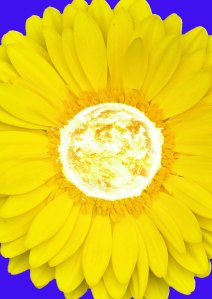
This is a very happy picture, I like it a lot. The water in the background, came from the lyrics “I swam across”, I changed the colour to purple to fit in with the brief. My main issue with this, is that it just doesn’t seem relevant.
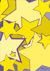
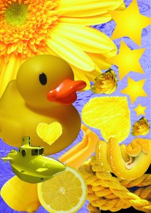
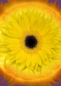
I decided to chose images to put together that I liked rather than using everything I could find. I chose a burning star and my favourite flower. I don’t really think I achieved anything here. The first of the two is ok, very yellow, but the second looks like I put an omelette on a flower. Again, it was a very yellow image, but there doesn’t seem to be much reasoning behind it.
Lyrics
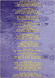
Next, I looked at the lyrics. There are a few different interpretations of what the song itself may be about, one theory is that Chris Martin wrote it about his dying mother, another is that it is a simple love song and he got the title from a Yellow Pages book that was in the studio… This hearsay isn’t very conclusive, so it makes sense to me to stick with my own thoughts – That it’s a love song.
Maybe I could just use the text. But once I had put this together, it didn’t look anything like a celebration of the colour yellow.
If I wanted to use the lyrics, I needed to be a bit more imaginative and bold, so that at first glance, the dominant colour was yellow.
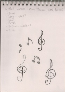
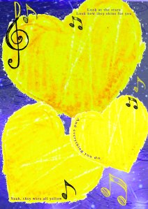
I decided to use stars, notes, water, hearts, water and a few lyrics.
I wanted to use a starry night sky as part of the background as opposed to using 5 point stars. It’s more fitting to the lyrics and I also wanted to create a flowing/organic image.
I changed the tints and shades of the hearts to give it a bit more depth. Overall it’s a nice image, but looks a bit like a generic greetings card. I think the problem is the style of heart I chose.
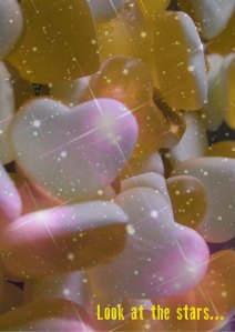
I tried using the haribo love hearts. Using an image of them randomly piled up gave a more irregular feel to it. I also put the stars at the front, so that they were more pronounced. I really like this image, but even with the top layer being as transparent as it is, I couldn’t get away with, the dominant colour being yellow.
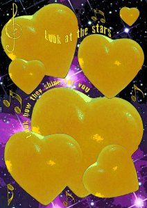
Next I decided to try something, somewhere in between the last two images.
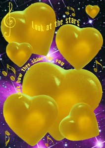
I added a poster edges filter to this to try and create a vintage/worn effect. I like the way it accentuates the edges of the text, and adds contrast to the yellow and purple areas.
At this point, I thought that I was happy with this as my final piece, but before uploading this assignment was when I found the research point on Graphic Designers that interest me. It changed my view on what I had created so far and I felt that I needed to design something else. Something that at least started to break down my current and limiting thinking of ‘everything in it’s place’. I wanted to attempt something a little more carefree. This is something that I think will actually be long process for me, but I’ll start with this.
“Don’t mistake legibility for communication” – David Carson
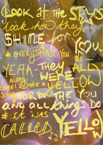
I decided that typed font was too uniform for what I was trying to achieve at this point, so used crayons, felt tips and highlighters to do the text by hand, scanned it and layered it over the collage background. I included some little sketches, from earlier designs, but tried to hide/merge them a little bit.
Handwritten Version
I looked back over some of Carson’s work, and this piece doesn’t emulate it in any way, so I looked back over the lyrics. I had previously skipped over the part ‘I drew a line’ thinking that it was not visually strong enough to pursue, but it’s a love song – he didn’t say it was a straight line, so I looked for images of hearts in the sand (the video was shot on a beach)
At this point, I knew that I needed to use the images of sand, stars and readdress the text. I used a mixture of handwritten text and typed text, making an effort to acknowledge Carson’s style in how I put it all together.
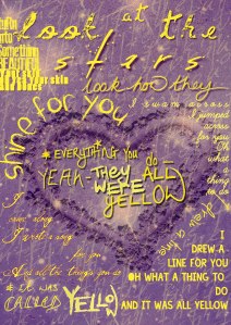
After choosing a specific style in which to do this, I realised that it was a bigger challenge that I initially thought. I had to build up a lot of layers to get back to the aim of achieving the brief (yellow being the dominant colour), because I was so set on trying to work in the direction of something similar to David Carson’s work that I’d got side tracked.
Even then, I’d say that the dominant colour was purple, so I added a faint yellow version of the background image, keeping the translucent star lit sky in place. The different shades of yellow, the purple drop shadows and strokes worked better than I had anticipated so I removed the purple sand heart altogether.
Final Piece
I do have a lot more to learn about visual communication and honing in on a style, but this unit has been the biggest step for me so far. Trying to work towards someone else’s style is quite a challenge, especially when his whole approach is essentially the complete opposite to mine.
Discarded Idea:
I thought about the Abstract Cities exercise, and wanted to see if it would translate, with just blocks of colour. I used different shades of yellow, and purple to create contrast and depth. I don’t like it, I’m still struggling to make a connection with the idea of abstract art.