Lorem Ipsum
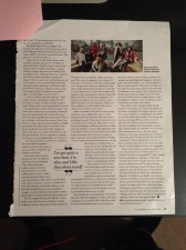
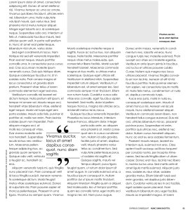
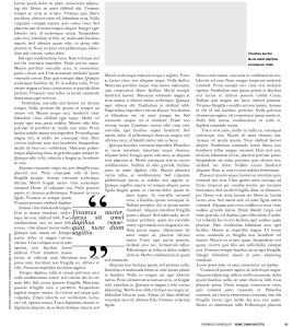
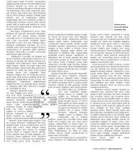
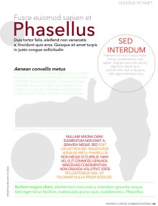
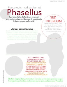
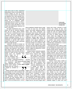
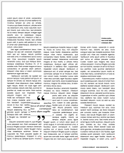
My brief is to take one of the publications from the previous research point (Readable Publications) and recreate it as closely as possible, replacing the text wit Lorem Ipsum.
This made me look very closely at the layout, margins, spacing etc.
The first item I chose was one with a lot of text.
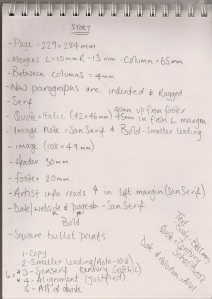
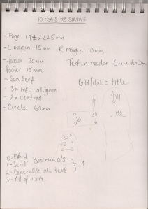
I made notes on the details and possible adjustments.
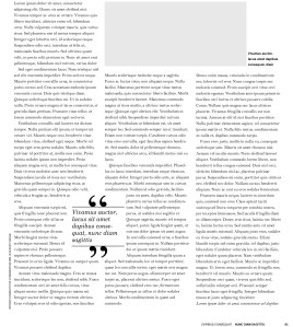
Copy
I am pleased with this recreation, and I learned more about how to use Illustrator. I wanted to make one change at a time and take time to look at how/if it changes how easy it is to read.
Change 1: Smaller leading. In the version above, leading was set to 13pt. I set it to 10.8 (auto)
I think this reduced how easy it is to read.
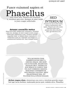
Change 2: San Serif typeface
I think this made it easier to read.
Change 3: Alignment, I changed all text to ‘justified’
I think this is easier to read.
Change 4: All of the above.
Although I think that this is easy to read, I think that the large leading in the original item/my copy is an important factor.
Change 2 & 3 (San Serif typeface and justified alignment)
I think this is the version that is easiest to read, it’s not too crowded or fussy.
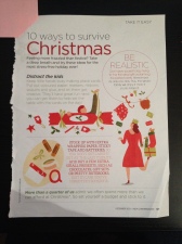
The second item I chose was made up from lots of small bodies of text.
Notes on the details and possible adjustments.
Copy
Again, I wanted to make one change at a time and take time to look at how/if it changes how easy it is to read.
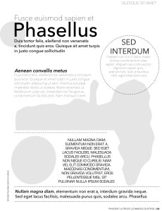
Change 1: Black and White
I don’t think this made any difference to how easy it is to read. A little boring to look at maybe.
Change 2: Serif typeface
I’m not sure that this makes any difference, I just don’t think it looks as good overall.
Change 3: Centralise all text
Again, little affect on the readability, but it doest fit was well with the images.
Change 4: All of the above.
This looks boring and poorly laid out.
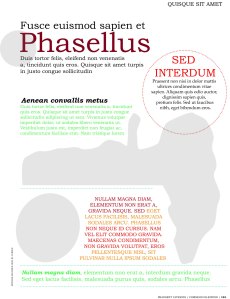
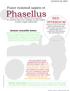
Change 2 & 3: ‘All of the above’ in colour.
Keeping the colour, didn’t improve the other changes. I think that the original/copy is the easiest to read and best layout.
This was a really valuable exercise, it encouraged looking closely at details in bodies of text, and how small changes can have a big affect on how a publication is viewed.
Response to Tutor Feedback
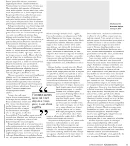
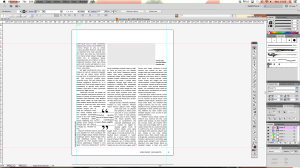
In the first recreated article, I omitted the white space at the top of the page. This is a frustrating error, because it is so basic, and does have an obvious effect on the overall readability of the article. In light of this, I reopened the document to make the adjustment to find that I had in fact included all boarders but they seem to get cropped whenever converted to jpeg.
Although I’m glad I didn’t make the mistake, it seems I need to look into this to avoid it in the future. Also, since doing this exercise, I have learned more about Indesign – Clearly a more suitable programme for this exercise.
I’ve included screenshots to show my working document:
